Triangle Forklifts
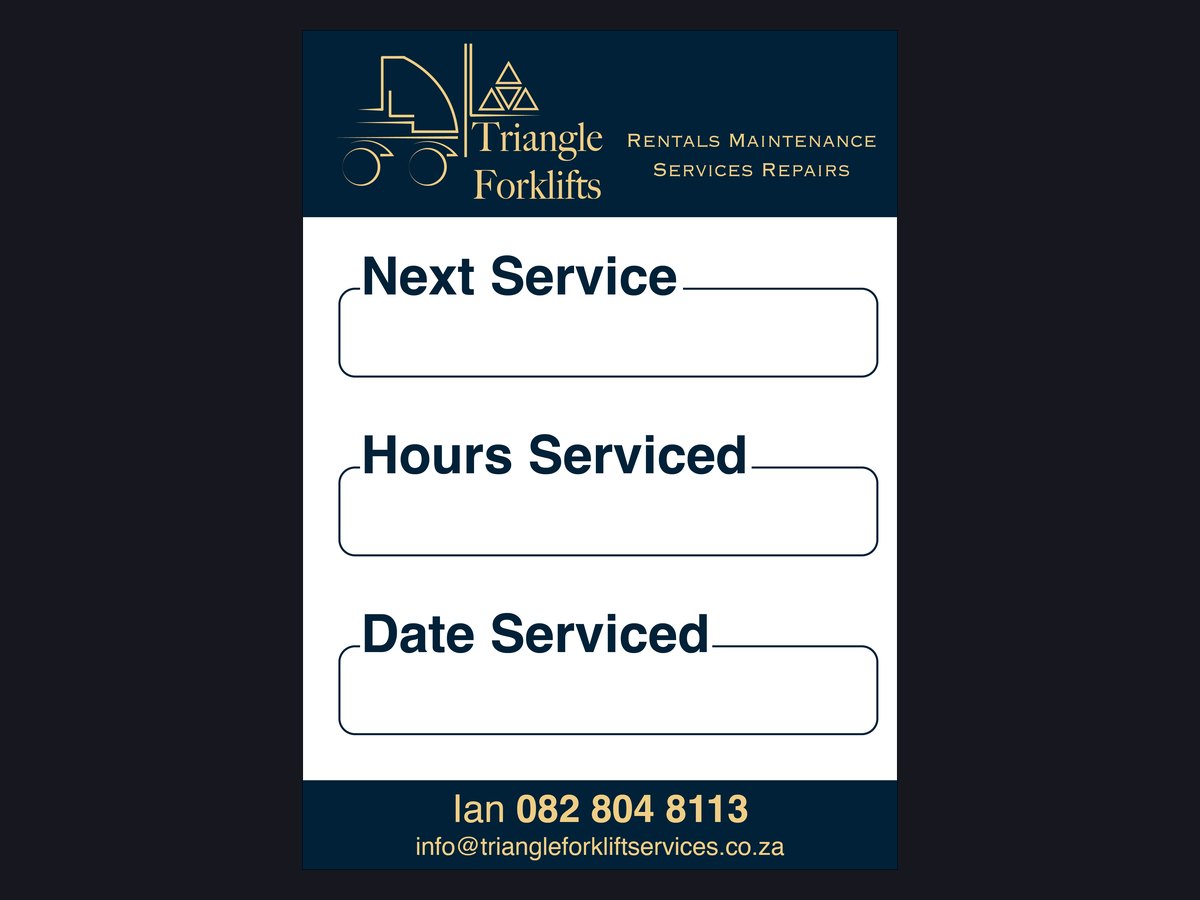
A navy and gold identity for a forklift rental and repair business, carried through the letterhead, the email signatures and the service stickers that go on every machine.
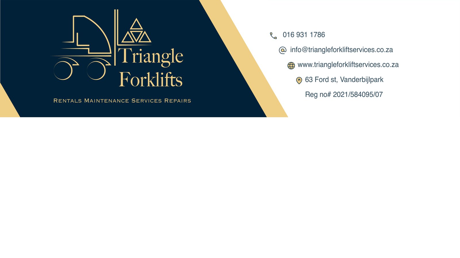
Everything the company puts in front of a customer, from the first email to the sticker on the forklift, now looks like it came from the same business.
The brief
Triangle Forklifts rents out, services and repairs forklifts around Vanderbijlpark. They wanted to look like the established, trustworthy company they are: paperwork that matches, emails that match, and a reminder of who services the machine on the machine itself.
What we delivered
The logo is a forklift drawn in thin gold lines, with the load on the forks made of three triangles for the name. Navy and gold give it a solid, dependable feel that suits an industrial business without looking heavy.
The letterhead puts the logo in a navy band with a gold diagonal stripe and the contact details alongside, leaving a clean white page for quotes and invoices. Each director has an email signature with the same line drawn forklift as a watermark and a forklift on the open road fading in on the right. The service sticker uses the same navy and gold with big, clear fields for next service, hours and date, so it can be read at a glance in a warehouse.
On paper, in email and on the machine

Tell us what you need and we will tell you how we would build it
A WhatsApp message or an email is enough to start. We reply within one working day with questions, a rough plan and an honest view of what it will take.